Tuesday, December 6, 2011
Bern Porter video Karma Bookshop
EXCURSUS I: KARMA Bookstore(Part 2) from Excursus on Vimeo.
Amazing.Source: http://www.icaphila.org/excursus/saturday-sunday-nov-12%E2%80%9413-2011
Monday, December 5, 2011
Enter The Void trailer
While on the film title topic...
I've seen this film a couple of times now. Recently at the Astor (needs to be seen on the big screen!). The title sequence is ridiculously dope. Much can be read about 'the making' of it online.
Dr. Stranglove or: How I Learned to Stop Worrying and Love the Bomb, Stanley Kubrick, 1964
Saw this film at the Astor last night. The trailer is brilliant, as is the film. There is nothing quite like big, bold, white/black type in film titles...beautiful. I love the way the type rapidly alternates between the scenes from the film - it communicates the sense of urgency and anxiety during the imminent danger of nuclear war, in a darkly humorous way. Having just seen the film, I think it translates the essence of it really aptly.
These are the opening titles. The hand drawn typography is great. Once again - white type, which work so well when running over film sequences. It is interesting that this style of hand drawn typography is becoming so popular in graphic design at the moment...this film was made over 40 years ago and feels so contemporary. Film titles are such a rich realm of inspiration.
Wednesday, November 30, 2011
3024 records
3024 is a record label that puts out some seriously dope music. Run by Martyn and Erosie I think. Erosie does the album design/artwork. They are so vibrant, expressive and experimental, much like the music on the label and the bass/electronic music world in general at present.
http://www.erosie.net/
http://3024world.com/
Friday, November 18, 2011
kubik identity
http://kubikmelbourne.com/
The identity for Kubik - a performance space, which is part of Melbourne Music Week, which is starting this weekend. There is a series of postcards contained inside a folded poster, as well as some post cards with glow-in-the-dark varnishes! I really like the use of geometric shapes, the contrasting colours and the way the typographic and shape elements are arranged into compositions. Quite an experimental approach and really visually interesting identity. Really appropriate for a showcase of experimental electronic music.
The posters are all over melbourne. I'm not actually sure who designed this yet, but I'll make sure I enter the designer name once I know.
Thursday, November 17, 2011
parra
I really dig Parra's simple, strong illustration style. Risograph printed.
Source: http://byparra.com/more-work/
Thursday, November 10, 2011
riso print
Completely rad risograph print. By Roel Wouters, who produces some really interesting work.
Source: http://roelwouters.com/
Monday, November 7, 2011
Saturday, November 5, 2011
9
The curves in this baby are amazing.
source: http://www.flickr.com/photos/maraid/2835928775/in/set-72157607163315565/
Friday, November 4, 2011
MOMO
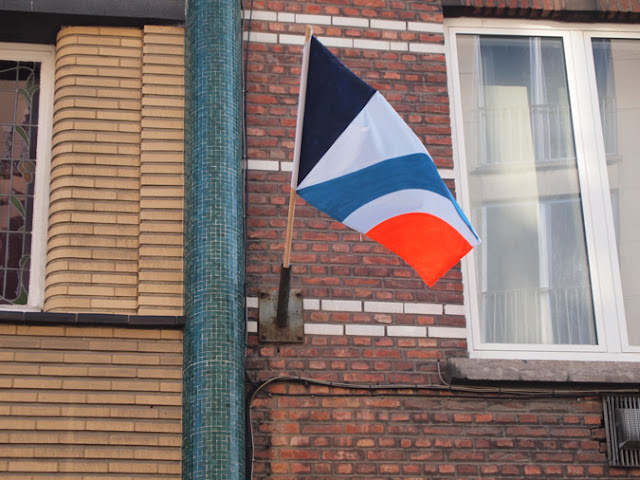
Really interesting street artist. Love the use of colour and shape. The flag project is especially interesting - if colour was introduced into this street in the form of graffiti it would be removed promptly, whereas these flags remained for some time (they were installed without permission).
Check this video, which shows their production and installation: http://vimeo.com/28598667
Sunday, October 16, 2011
Paul Rand + Steve Jobs
An identity proposal for Steve Jobs by the designer, Paul Rand. It's great to hear a story of two brilliant minds working together.
The clear way in which Rand has put together the booklet explaining the identity and thought process is such a beautiful example of clear, simple communication.
In the interview, Rand says that aparently Jobs came up with the name for Apple because he liked apples, and no-one else had an idea! (This is probably another example of Steve Jobs amazing intuition though). It is interesting that an arbitrary symbol can become such a recognisable brand (they discuss this in the interview in the link below).
Source: http://imprint.printmag.com/branding/paul-rand-steve-jobs/
Saturday, September 17, 2011
Sunday, August 7, 2011
Tuesday, July 26, 2011
ugly signage?
I think that old, dated and 'cheesy' signage is beautiful The urban landscape is saturated with new, contemporary, fashionable design that it gets boring. I think it's really important that old signage of this type is documented before everything becomes gentrified.
Labels:
typography signage melbourne
Saturday, July 2, 2011
nine melbourne laundrettes
This is project undertaken last semester at uni. It was inspired by the artist Ed Ruscha who created the work, twenty six gasoline stations, and some other publications - these works were documentation of every day things. Below are some pictures of his work.
I designed a poster/booklet which was housed inside a soap box. The box was opened by tearing a perforation along the edge. The idea was is for it to be like a guide kit to laundrettes to give people a new appreciation of them.
Ruscha's photos are more beautiful than mine and I think his presentation is more refined. I found it difficult to document laundrettes in the way that Ruscha documented subjects because they are not stand-alone buildings like service stations are or apartment building are. They are usually in a strip of shops, so the building really like any other shop. The laundrette is only really identified by the signage at the front.
In retrospect I think I should have shot them in black and white, because the light and colours between each shot are not consistent enough. Also, I should have presented the photos in a simple perfect bound book, as Ruscha did. I'm planning on re-working this project in the format of a zine.
Labels:
my own work,
signage,
typography
Subscribe to:
Posts (Atom)


