Wednesday, November 30, 2011
3024 records
3024 is a record label that puts out some seriously dope music. Run by Martyn and Erosie I think. Erosie does the album design/artwork. They are so vibrant, expressive and experimental, much like the music on the label and the bass/electronic music world in general at present.
http://www.erosie.net/
http://3024world.com/
Friday, November 18, 2011
kubik identity
http://kubikmelbourne.com/
The identity for Kubik - a performance space, which is part of Melbourne Music Week, which is starting this weekend. There is a series of postcards contained inside a folded poster, as well as some post cards with glow-in-the-dark varnishes! I really like the use of geometric shapes, the contrasting colours and the way the typographic and shape elements are arranged into compositions. Quite an experimental approach and really visually interesting identity. Really appropriate for a showcase of experimental electronic music.
The posters are all over melbourne. I'm not actually sure who designed this yet, but I'll make sure I enter the designer name once I know.
Thursday, November 17, 2011
parra
I really dig Parra's simple, strong illustration style. Risograph printed.
Source: http://byparra.com/more-work/
Thursday, November 10, 2011
riso print
Completely rad risograph print. By Roel Wouters, who produces some really interesting work.
Source: http://roelwouters.com/
Monday, November 7, 2011
Saturday, November 5, 2011
9
The curves in this baby are amazing.
source: http://www.flickr.com/photos/maraid/2835928775/in/set-72157607163315565/
Friday, November 4, 2011
MOMO
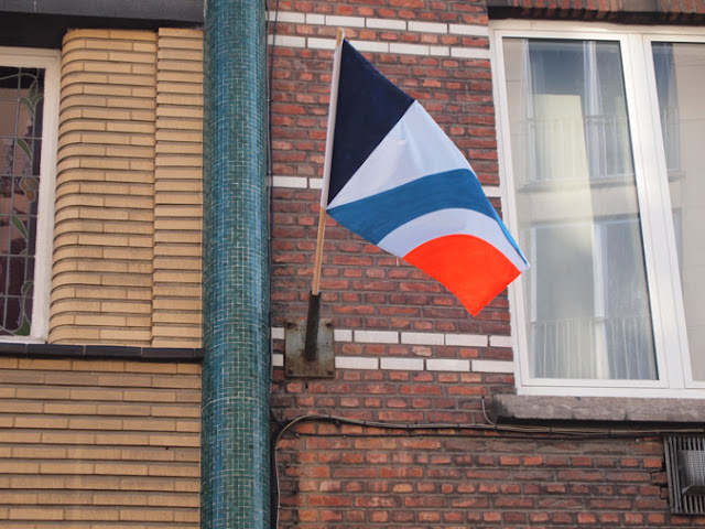
Really interesting street artist. Love the use of colour and shape. The flag project is especially interesting - if colour was introduced into this street in the form of graffiti it would be removed promptly, whereas these flags remained for some time (they were installed without permission).
Check this video, which shows their production and installation: http://vimeo.com/28598667
Subscribe to:
Posts (Atom)


